Designing for Speed
I started writing a piece a while ago about the long, tedious journey of getting my website to a perfect pagespeed score. And one thing I kept coming back to was: “this may be hard to do today, but if you planned it into your code from the start, it would be easy to maintain.”
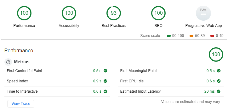
That 93 in Best Practices is "Does not use HTTP/2" which my host does not support. Gah.
There are probably many reasons people don’t plan pagespeed into their designs, one of which is that a lot of their design/template comes from a designer or a prepackaged theme, but I’m going to talk about a few things I would do differently if I had to design a site from scratch.
Separate your critical path
The critical path, also known as “Above the Fold” is anything that needs to be loaded for that sweet, sweet first paint. That is, in many cases, what UX experts and tools are considering when they are judging your pagespeed. While most of us love to keep all of our CSS and Javascript in one big file, having separate files called critical.css and critical.js will mean you can defer or move all that other crap to the footer. If you’re following the maxim that your above the fold content should be simple, you should only have a header and maybe 1-10 elements visible when the page loads.
A sub-point here: no sliders in your critical path. Sliders are big and they build weird, bulky markup and styling and they require javascript to process. Every study ever done shows that sliders are bad for your UX and conversion rates, and they will slow down your pageloads and dampen your conversions. They seem great on paper - but so did my ex-wife.
Actively manage your images
Unless you’re writing your HTML by hand, the language and framework you’re using will certainly allow some kind of re-usable snippets. If that’s the case, create (if it doesn’t already exist) a snippet or template for your images. This includes both <img> tags and any tag with background-image.
Pack that with all of the classes and attributes required to dynamically size and lazy-load your off-screen images. If you do it once at the beginning, you only ever have to worry about invoking it every time you need a speed-conscious image.
Google is also been on a kick about next-gen image formats. That’s something you can build in as well, because they don’t have universal browser support.
Here is a great breakdown on speedy images
The Little Prince Method
I call this the little prince method not because of the Little Prince but because Antoine de Saint-Exupery Method is a lot. Ironically, for a guy with a name like that, he is quite famous for the quote:
Perfection is achieved, not when there is nothing more to add but when there is nothing left to take away.
Designing for speed, and in many cases for purpose, isn’t about packing every page with as much garbage as possible. It’s about deciding what each page is supposed to do and having it do only that thing.
For example, if you’re running an e-commerce store, your homepage’s only job is to give people a quick overview of what you sell (a few lifestyle images, maybe some testimonials) - leaving them to decide whether or not they want to browse your store. And if your store loads quickly, they will!
You don’t have to shoehorn in a section for every single product category, each with its own slider (shudder) of products. If you really want to show products, show 3-6 of your most popular in a static grid and be done with it.
I guarantee you, “all the things”-related slowness is causing more damage to your conversions than forcing your customers to browse your store manually.
-
So there you have it. It’s not a comprehensive list, but at the very least, maybe now you’re thinking about speed before you’ve launched your site. These little preemptive actions can save you a lot of time, money and headache in the future!